Intro: It Wasn’t Broken. It Just Wasn’t Speaking for Who the Brand Was Today!
Lead & Gain came to us with a solid business model and a site that looked decent, but it wasn’t competing where it mattered.
They were in a crowded space, surrounded by competitors ranking higher, messaging stronger, and converting faster. The issue wasn’t effort, it was structure and brand voice.
The site wasn’t built for growth.
Our goal wasn’t just to make it look better.
It was to help Lead & Gain stand out, get found, and turn visits into action.
Step 1: Understanding the Competition
Before we touched design, we studied the playing field.
Their competitors were:
Ranking for long-tail service keywords Lead & Gain didn’t have pages for.
Using content structure that clearly explained what they did and who it was for.
Owning search results with optimized metadata and fast, responsive pages.
Meanwhile, Lead & Gain had:
Generic site copy not targeting search intent.
No clear content hierarchy for SEO.
No keyword strategy mapped to their buyer journey.
Our goal: Build a smarter structure — one that told Google and the visitor exactly what Lead & Gain did, why it mattered, and who it was for.
Step 2: Rebuilding SEO From the Ground Up
The old site had little SEO foundation — no page-level targeting, unclear H1s, and almost no metadata optimization.
We built a clear structure from scratch:
Keyword mapping tied to customer intent (“EOR for Recruitment Agencies,” “Global Payroll Compliance,” “Onboarding Software”)
Proper hierarchy with one primary topic per page
Optimized title tags, meta descriptions, and alt text
Internal links that connected service-level pages together for relevance
Result:
The new SEO architecture positioned each page as its own ranking opportunity — improving visibility and keyword depth while keeping the experience simple.
Step 3: Designing for Direction, Not Decoration
The old site design looked fine, but it didn’t guide the user anywhere. There was no flow — no visual rhythm that moved visitors toward the next step.
We built a layout that led visitors through the story:
Who you are and what you solve — right at the top.
Why it matters — clear proof and visuals that explain the product.
What to do next — a consistent “Schedule Demo” CTA across every section.
The result was a design that didn’t just look cleaner — it converted better.
Simplified navigation
Consistent visual hierarchy
Clear messaging and purpose on every page
The site became an experience, not a brochure.
Step 4: Building Out Service-Level Pages for SEO
To compete with larger players, we needed depth.
We created dedicated service pages around specific audience needs — each optimized for SEO and conversion.
Each page included:
Search-driven headers and copy
Visual examples of the product in action
Targeted CTAs to capture interest
This gave Lead & Gain multiple ways to rank and connect with the right visitors — while showing authority and relevance to search engines.
Step 5: Showing the Product — Not Just Talking About It
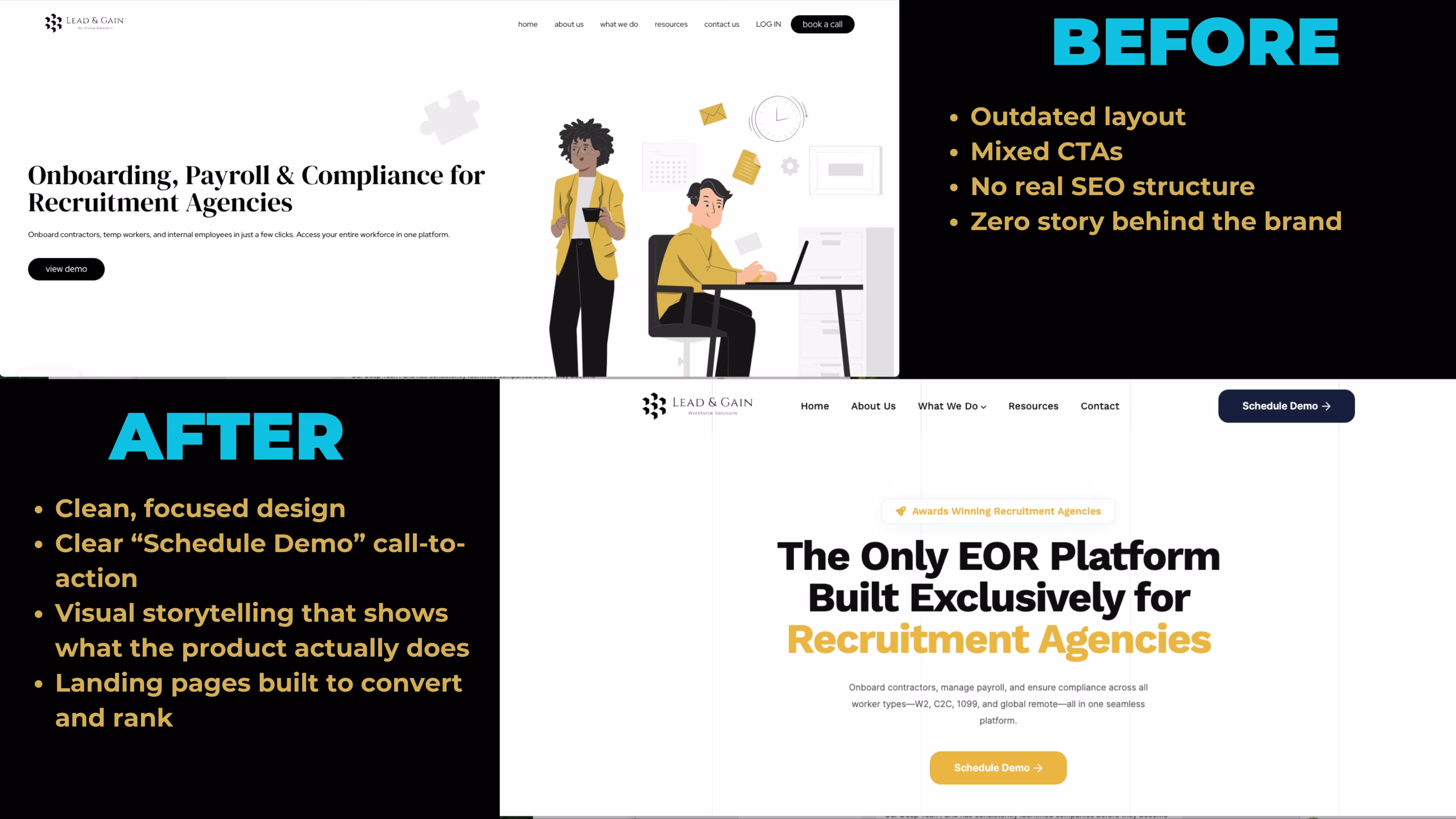
Before, visitors couldn’t clearly see what the platform did.
We added product visuals and workflow examples — helping users connect the dots between Lead & Gain’s promise and the real-life solution.
The goal was to build confidence quickly, with visuals that explained what words alone couldn’t.
Visitors could now scroll, understand, and take action — without confusion.
Step 6: Connecting the Backend — Data That Actually Flows
The redesign wasn’t just about the front end.
We connected everything to a new CRM system, ensuring leads were tracked from form submission to follow-up.
Old setup:
Forms weren’t properly tracking
Leads were entering multiple tools inconsistently
Reporting was manual and incomplete
New setup:
One connected CRM tracking all lead sources
Automated email responses and tagging
Clear visibility into pipeline and campaign performance
- New AI Chat bot for lead generation and better sourcing into the right person for follow up
- New quiz for getting people to the product they need and setting up automation to guide the customer through booking demo.
This created a feedback loop — now every marketing action could be tied to a measurable result.
The Results
Before:
Outdated structure, unclear story, minimal tracking
Disconnected tools and no SEO foundation
After:
Fully optimized SEO architecture
Clean, conversion-driven design
Clear service pages for visibility and depth
CRM and lead tracking connected to real data
Visitors understanding the product in under 10 seconds
Lead & Gain’s site now works like their business — streamlined, clear, and ready to scale.
Key Takeaways
Great websites don’t just look good — they’re structured to win.
SEO starts with intent and structure, not just keywords.
Design should lead customers to understanding and action.
A connected CRM completes the loop — from traffic to measurable results.
Ready to Fix Your Foundation?
If your website looks good but doesn’t perform, it’s time to rebuild for results.
We’ll help you create a system that connects SEO, design, and CRM — so your business flows the way it should.
Author
Sean Wolf
With over 16 years of eCommerce leadership, I specialize in architecting and scaling Direct-to-Consumer brands across both established and emerging markets. Most recently at Johnson & Johnson’s Kenvue division, I spearheaded the end-to-end launch of a startup women’s health platform targeting the menopause segment—driving a seamless omnichannel experience through enhanced UX/UI, strategic 3PL partnerships, and the successful rollout of Salesforce Marketing Cloud to automate and optimize the full CRM lifecycle. These initiatives not only elevated customer engagement and on-time delivery metrics but also delivered double-digit improvements in conversion rates and customer retention.


